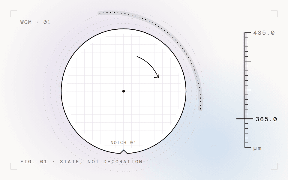
An operator interface for a wafer grinding machine, where one wrong screen state can destroy a wafer.
I joined three years into development, with no brief and no UX docs. As the sole designer among about 30 people across three vendors, I turned years of hardware logic into an interface operators can trust and frontend teams can build.
NDA project. Visuals are AI-reconstructed. No real machine screens, data or client IP are shown.
- Role
- Sole designer, in the front-end team
- Team
- ~30 people, 3 vendors
- Joined
- Year 3 of the project
- Validation
- Passed hardware validation
- Status
- Ongoing R&D
Three years of hardware logic, and no brief.
"A bug here doesn't just look bad. It destroys the wafer." The machine already worked. My job was to make the screen match it exactly.
- 01No brief, no UX docsEverything had to be reverse-engineered from Confluence pages, sensor layouts and backend status codes.
- 02Zero tolerance for errorA wrong state on screen can waste a wafer and time on very expensive equipment.
- 03Multi-vendorHardware from a Japanese manufacturer; software split across three Vietnamese vendors under strict NDA.
- 04No access to the machineIt sits in a cleanroom. I designed every machine state without touching it.
Nothing reached frontend without an engineer signing off.
Under the NDA, hardware engineers were the experts every screen state was checked against.
- 01Read the specWork through Confluence manuals, sensor layouts and backend status codes to find every machine state the screen must show.
- 02Propose the UI stateDesign how that state looks and behaves on the operator screen.
- 03Engineer reviewReview it with hardware engineers. Nothing moves on without their sign-off.
- 04Hand off to frontendPass the approved state to frontend with clear component states and data expectations.
Repeats for every state.
Bigger targets. Fewer choices per screen.
Operators wear cleanroom gloves, so standard tap targets are too small. Compare the two.
Three calls for the cleanroom.
Glove-optimized UI
Operators wear cleanroom gloves, so standard tap targets are too small.
- Rule 01Every touch target at least 50px; primary controls at 64px.
- Rule 02Destructive actions sit apart, in red, never next to Start.
- Rule 03Three controls per panel, so a gloved hand has one clear choice.
How I worked within them.
A classified R&D setting called for a different kind of rigour.
- 01Strict NDAHardware engineers acted as the domain experts. Every UI state was validated against their spec sign-off.
- 02No hardware accessI reverse-engineered machine behaviour from specs, sensor layouts and backend status codes.
- 03Zero tolerance for errorA mandatory review loop: nothing reached frontend without hardware engineer sign-off.
- 04No brief or UX docsI spent the first months on documentation before opening Figma.
Start from the state diagram, not the documentation.
I spent my first months reading specs front to back. Most of what I read early on never reached the screen. I should have mapped the machine states first and used that map to decide which specs mattered.
- Precision over creativityIn industrial HMI, familiarity and accuracy matter more than novel UI.
- NDA is a design constraintWithout visuals, value has to come through in reasoning and process.
- Design as translationThe job was turning hardware constraints into operational safety.
Bring the specs. I’ll find the interface in them.
For hardware, data-heavy or multi-vendor products where the UI has to match the system exactly.
Similar work: UX audit, quoted after a short call